10 Reasons the Miami Dolphins Throwbacks Must be Permanent
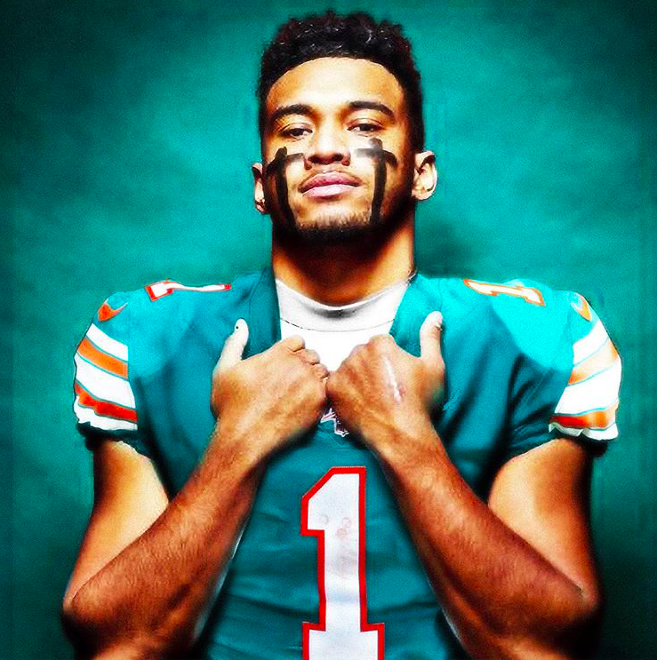
For the better part of two decades, watching the Miami Dolphins play football has been like watching old people fuck. But that might have mercifully changed after the Dolphins went and did the most un-Dolphins thing possible: They drafted the best quarterback in the 2020 class: Tua Tagovailoa (HOLY SHITROCKETS, RIGHT?). And now, after waiting a whole week, Tua finally announced that he’ll be wearing No. 1.
So what’s the next move for the Dolphins? Oh, that’s an easy one. What’s next is that they need to make the throwback uniforms a permanent thing. That’s it. That’s all. Bring back the old uniforms and call it a day.
Here are the 10 reasons why the Dolphins need to stop fucking around already and start wearing the throwbacks from now until the sun supernovas:
10. They’re Classic NFL
When you think about NFL teams with rich storied and winning traditions, you immediately think of teams like the Oakland Raiders, Green Bay Packers, Pittsburgh Steelers, and Dallas Cowboys. These teams have been the epitome of greatness, tradition, and winning since the dawn of the league. Each of those teams has its own rich history and has become iconic to the NFL. And yet, for as long as those teams have been around, they’ve never once screwed with their look. The Steelers are known for their gold and black colors and still have that stupid logo that inexplicably appears on only one side of the helmet. The Cowboys have tweaked their look a few times, but never to the point where they’ve completely abandoned it — it’s still the classic royal blue and antebellum white with a big star on a silver helmet. Washington won’t even change their ludicrously racist name, let alone their colors and logo, but for some shit-headed reason, the Dolphins decided to toss their original badass colors and menacing dolphin logo from their greatest years for a weird dolphin and the colors of the swimming pools at a Sandals resort.
9. They’re Menacing AF
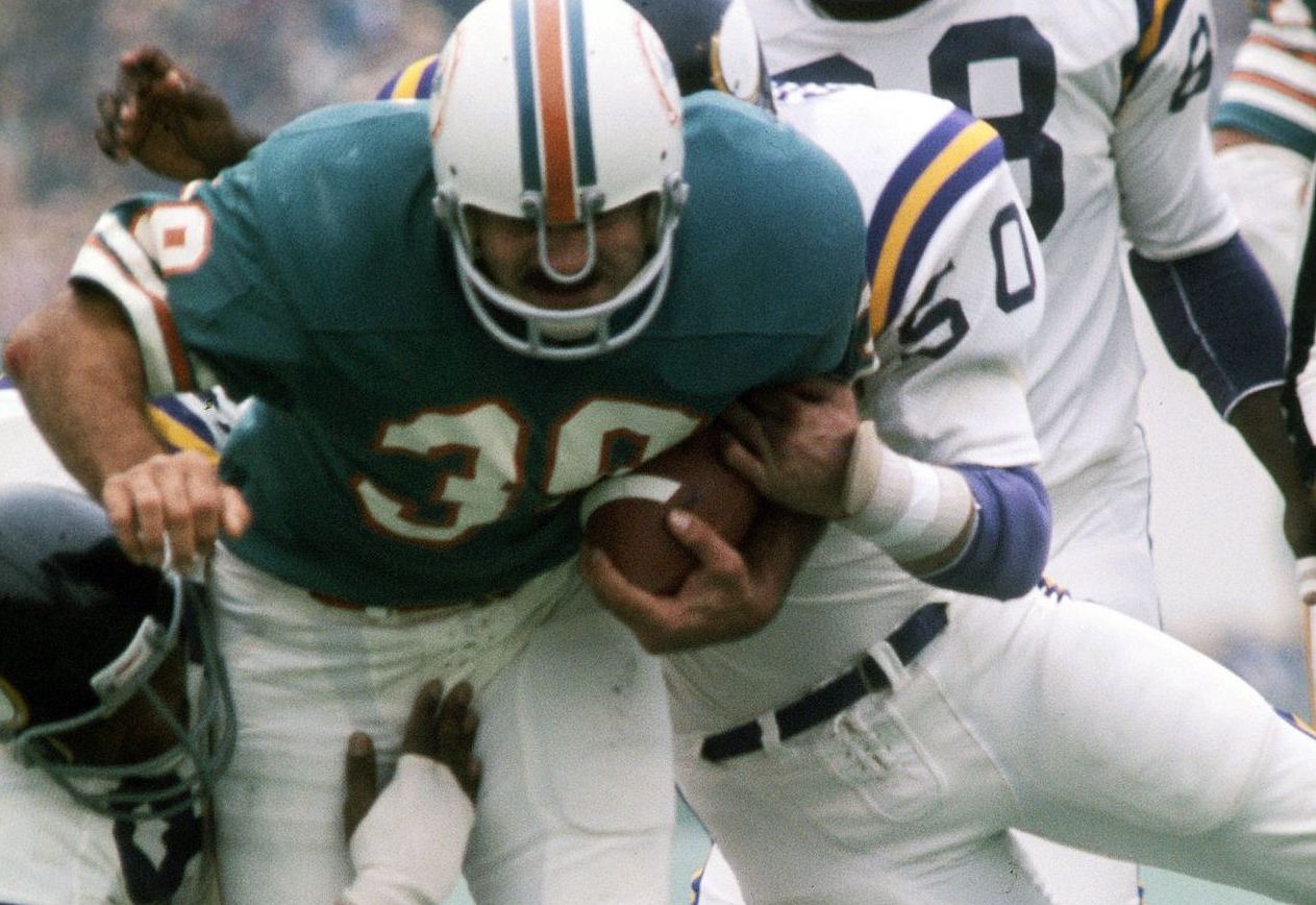
When you see the Dolphins’ old color scheme, you can’t help but think of the 1972 Dolphins and their dominant, face-obliterating ways. Those old teams would step inside an opposing teams’ asshole and make themselves right at home. It was synonymous with HERE COMES THE PAIN. The classic solid orange stripe going down the center of an eggshell-colored helmet, the white pants with thick stripes, the dark aqua jerseys, the large numbers with orange borders — it all harkens back to the days when Miami was a team to be reckoned with. That tradition was passed down to the Marino Era and again to the bone-crushing Jason Taylor-Zach Thomas years. Those color schemes made other teams hurt and bleed and shit themselves. The current uniforms make other teams confused, wondering if they’re in a generic football commercial where the NFL didn’t allow official licensing to be used.
8. They’re the True Colors of the Dolphins
Think back to every amazing memory as a Dolphins fan (or, if you’re too young, YouTube them and then cry into your pants) and they all feature the Fins wearing their old uniforms and colors. The ’72 Perfect Season; the Super Bowl victories, Dan Marino putting a flamethrower to the passing record book, the defeat of the 1985 undefeated Bears on Monday Night Football; the Spike Play; the AFC Championship game against the Steelers in the Orange Bowl; the Clayton-Duper connections; the Hook & Ladder play; the A.J. Duhe game; Leon Lett on Thanksgiving; Jason Taylor removing Tom Brady’s testicles during his Defensive Player of the Year season. All of these moments featured the throwbacks. These uniforms are the Miami Dolphins. The most iconic moment for the recent uniforms is when the long snapper hit Brandon Fields in the face with a football.
7. The Old Logo Looks Like an Actual Dolphin
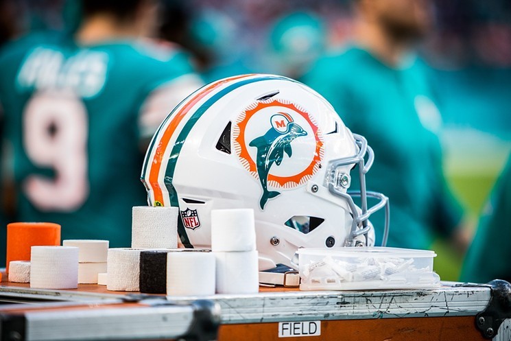
The old logo featured a menacing dolphin wearing a football helmet and jumping through a blazing hoop (or maybe it’s the sun?). Menacing porpoise, football, fire. Simple. The current logo looks like maybe it’s a porpoise, though one can argue it can also be a whale, with dead soulless eyes, sort of, maybe, breaching the water, because it’s probably run out of breath. It also kind of resembles a dildo.
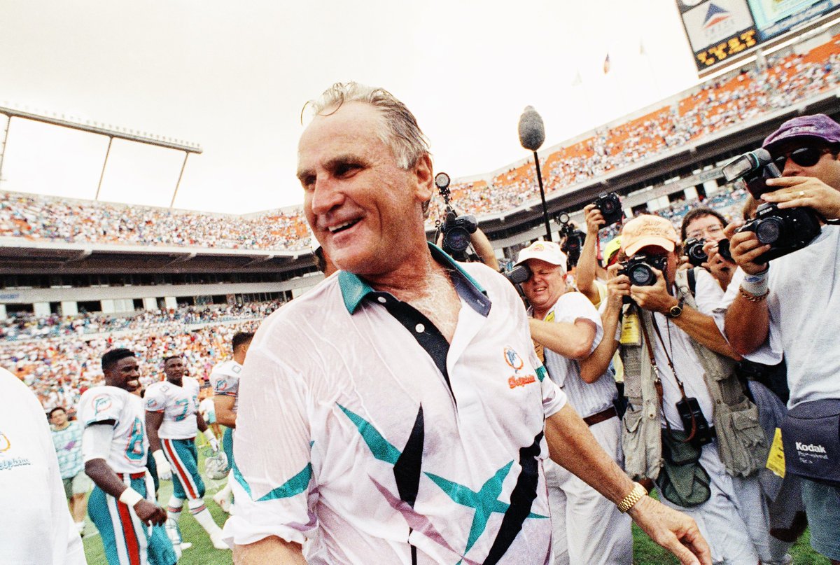
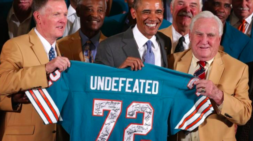
6. Because The Memory of Don Shula Deserves Better
It’s a no brainer that the Dolphins are going to have their players wear a patch honoring Don Shula after he passed away earlier this week. But it’ll be an insult to the memory of man who was the paradigm of excellence if that patch is sewed onto those current middling Aquafresh uniforms. For 25 years, Don Shula’s Dolphins made us all feel that ever elusive feeling year after year: Hope. As opposed to the feeling the current Dolphins give us of having a baby raccoon jammed up our collective assholes and telling us we like it. Don Shula deserves better than to have his initials slapped onto these hideous things.
5. The Current Uniforms Represent Mediocrity
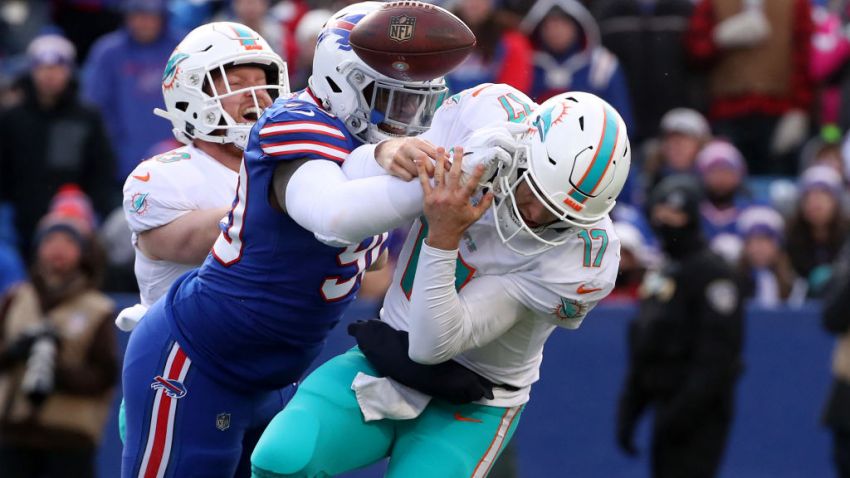
It’s simple: these current uniforms represent a large steaming pot of broiled ass, which is what the Dolphins have been the entire time they’ve worn these hideous things. These new-look logo and colors were unveiled in 2013, which came right in the midst of the worst era in franchise history. While the throwbacks conjure feelings of a rich winning tradition, these current uniforms conjure feelings of being murdered in the face every year for the rest of your miserable football-watching life until you die utterly alone like the sack of shit your mother always said you’d amount to. These uniforms represent everything that has gone wrong with the Dolphins. They represent a team that can’t score more than ten points a game and can’t finish better than 7-9 year after year after year. These uniforms don’t know what a playoff game is.
4. They Don’t Look Like Something SeaWorld Employees Would Wear
The throwback uniform and color scheme look like football. The current uniform and color scheme look like something SeaWorld employees wear while they make enslaved orcas jump through hoops for tourists. The old menacing dark aqua color has been replaced with a crystalline pool-colored aqua scheme that screams OOWWW DON’T HURT ME, FOOTBALL PERSON. What you want in your team colors is something the other team will fear and something fans can embrace and be proud of. Instead, we have guys suiting up like they’re about to go make sea lions ride on skateboards for fish. The current logo looks like an aquarium exploded.
3. They Just Feel Right, Aesthetically
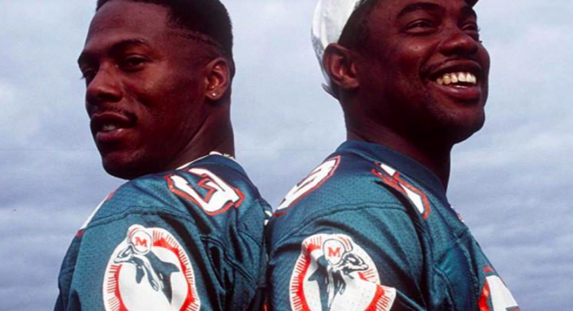
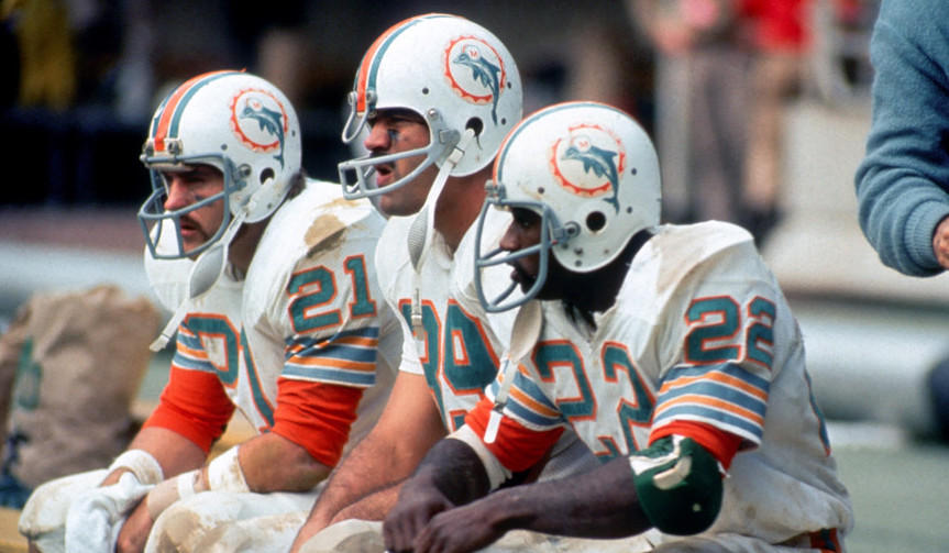
Look, we understand that team success has everything to do with talent and zero to do with uniform colors. Still, when you watch this team play in these colors, your asshole automatically puckers up because you just know this team is about to get destroyed by Derek Carr en route to a 7-9 record and zero playoff appearance. You look at any player wearing the old colors, and you KNOW that guy fucks. Look at those three up there. You can’t tell us they didn’t FUCK. Because they did. It’s just the way those old uniforms work. It’s science!
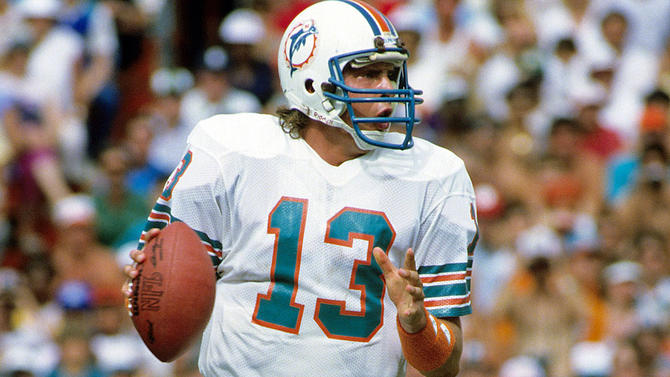
2. Look At That Sexy MF Up There
Look at him. Drink him in. You can’t look away, can you? That right there is the living embodiment of a thunder clap from the gods. And that uniform is the armor of an elite gridiron warrior that would go on to shred the NFL record book so badly, they still show his beautiful face on TV every time a current quarterback reaches some kind of milestone — 20-plus years after he retired! That’s the uniform of excellence, of badassery, of a team that was an absolute freight train of devastation, cockpunching opposing teams with their football prowess, littering the field with the decaying corpses of Steelers, Patriots, Bills, and Jets and telling any and all those who opposed them to go and fornicate with farm animals. These current Dolphins have ruined football in this town. Did they have to ruin the way the team looked too? There was simply no reason for the Dolphins to change their uniforms in 2013 outside of wanting to make more money through merchandising. But there are other ways to make money with merchandise that doesn’t include urinating all over the only thing this team has left: tradition.
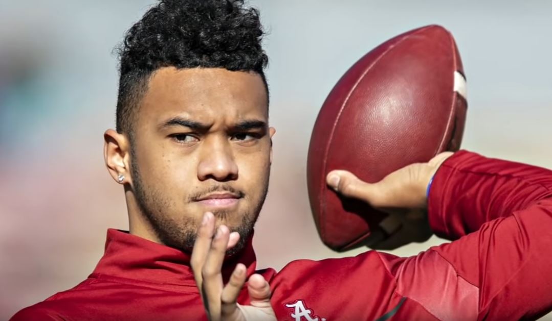
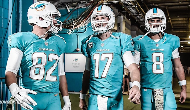
1. Because TUA IS HERE NOW
We have gone from Vegetable Lasagna toe-thumbs to, in all likelihood, Dan Marino’s true heir. And he’s finally chosen his jersey number. Let’s not start this new era of hope by draping these unicorn shit stain-colored middling as fuck uniforms on the new Chosen One. The Miami Dolphins currently have the most badass motherfucker at QB since The Right Arm of God roamed the land wrecking all of the ass. Tua deserves to play in a uniform that screams LOOK UPON MY WORKS AND DESPAIR, and not like he works at the Seaquarium Lolita tank.
Chris Joseph (@ByChrisJoseph) is a host of the Five Reasons comedy podcast, Ballscast. He’s written about sports and movies for Deadspin, Miami New Times, CBS Sports, and several other outlets.


This is one of the reasons I did not enjoy watching them for the past years they look like a team I don’t know back in the day I would shake and sweat knowing something was going to happen like Marino to mark Clayton for a 45 years td and even if they didn’t conect I still loved every min but with the vibrating dolphin my girl wants in her pants buzzing away is not my team I loved since 1976 I’m still a fin allways will be no matter what but I want my old helmet and colors back it’s un canning that 98% of the fans want this that alone is crazy to agree with that many fans they gotta hear this cry for our old team spirt with this new arm taking us to some super bowls I can feel the ring clinging go fins nation once again 🏈
An excellent article. As a kid, I remember watching Larry Csonka eat up the competition in the early 70s. He was my favorite. The traditional unis represent that era of greatness and MUST be brought back forever. Do it Dolphins!
This article is the greatest thing I’ve ever read
GREAT ARTICLE! The original colors are Aqua and Orange, the block numbers need to return, get rid of the Navy that every team decided to use 20 years ago and WEAR ALL WHITE AT HOME! If you do not think that uniforms make a difference look at the record when they wear the throwback uniforms. They are even good during the bad years. I beg them to go back to the original logo, the real Dolphin with the Helmet. I only buy throwback merchandise and would buy more if it were available.
Great article !
THE ORIGINAL COLOR IS TEAL AND ORANGE NOT AQUA AND ORANGE…
I agree 100% Dolphins throwback uniforms are the best look. The new uniforms look gay.
It‘s a no brainer! Even on the Fins own site, 93% of fans prefer the classic logo and uniform. When do 93% of people agree on anyting!!
Great article and a slam dunk for Dolphin brass to get just make change!
Please forward directly to Miami Dolphins. We need this!!!
Only Tua jersey I want is a throwback.
Completely agree. When are we officially allowed to change our uniforms again? Don’t we have to wait another two years since we technically updated the new ones with thicker orange lines two years ago? Once we do go back, I hope we pick the 80s logo with the larger dolphin as opposed to the original logo we’ve been wearing as throwbacks, but I’d be ecstatic with either.